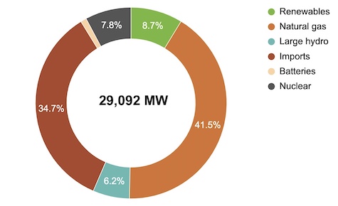
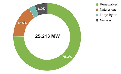
On the other hand, sometimes the grid has very little gas on it. Below is an example from April 27 of this year at 1:15 pm, when there was not only a lot of sun, but also a lot of wind, reducing gas to just 15% of the grid.
We all get this sometimes-clean, sometimes-dirty power. (2) Even though Bay Area power providers largely purchase low-emission electricity, that energy goes into a big puddle of grid electricity. We then consume from that puddle, getting a blend of what everyone has purchased, not just “our own” power. So we can reduce our own emissions by choosing to use electricity at cleaner times. (3)
I like to think about a metric called the “emissions intensity” of the grid, namely the amount of emissions produced for every unit of electricity being generated. When the grid is powered entirely by efficient gas plants, the emissions intensity would be about 0.4 mTCO2/MWh. (4) When there are more low-emission sources of energy, the emissions intensity is lower, in theory as low as 0. The grid is usually somewhere between those two values.
Emissions intensity is for me a useful metric for understanding “how much gas is on the grid”. CAISO publishes the current value on their Emissions page, calling it “emissions rate”. Take a look and see what it is as you are reading this. Then look at the Supply page showing the current grid mix. Do they match up? A number around 0.2 would mean that only about half of the electricity is coming from gas turbines.
Unfortunately none of the California Energy Commission (CEC), the California Independent System Operator (CAISO), or the California Air Resources Board (CARB) publishes historic emissions intensity numbers. The CEC does have access to the data for modeling purposes, but Michael Nyberg of the CEC told me that “all hourly generation data collected by the Energy Commission is automatically confidential and cannot be released,” adding that “The data we use for … modeling is obtained from the California ISO under subpoena.”
The staff at CAISO suggested dividing their historic “demand” data by their “emissions” data to get unofficial historic values for emissions intensity. The charts below show that calculation, with some additional caveats because of my limited skills downloading and processing the CAISO data. But I think they are illustrative nevertheless.
The graph below shows the (unofficial) emissions intensity of California’s grid for a recent temperate week in July. (5) You can see that it is regularly around 0.3 from evening to morning, and dips below 0.2 midday.

Another way to look at this is using a heat map, where times with higher emissions intensity are redder, and lower emissions intensity are greener. The colored bar below shows data for Tuesday, July 12 2022, with hours going from midnight on the left to 11 pm on the right. (6)

Staff at the CEC urge caution about using a chart like this to conclude that midday EV charging (for example) is better than midnight EV charging. “Using system average numbers to estimate the impacts of specific changes in load, such as load shifting, … can easily result in misleading results. In reality, (such a change) would result in a complex response from electricity supply that will have emissions impacts that may be counter to past system wide averages, or any overall changes in system-wide averages.”
What does that mean? To give one example, a hot summer afternoon may have greenish emissions intensity because of all the sun still available, but that might obscure the fact that solar is max’d out and any new demand would be covered by gas. When you add demand to a hot summer afternoon, you are likely triggering a gas plant to run (the plant that is “on the margin”). Evenings are especially problematic. Electricity supply has to ramp up as the sun goes down, so gas plants operate inefficiently as they quickly start producing more power. That results in any additional load producing even higher emissions.
So the emissions intensity metric doesn’t tell the whole story. If you are trying to decide when to schedule an electric load, it is probably better to look at the general trend in emissions intensity and choose times when it is decreasing or flat and avoid times when it is increasing. More precisely, what you want to know is, if you were to increase electricity demand at a given time, what power plant would service it and at what emissions intensity? I have written about this concept of marginal emissions before.
Unfortunately, I can find no public source of marginal emissions data to share with you either! (7) The best freely available proxy for marginal emissions that I can find is the grid’s battery charging and discharging curves. Batteries charge when marginal electricity is cheap (and clean) and discharge when it is expensive (and dirty). You can see an example below, showing how 2 GW of batteries was deployed on July 22 to help clean up our electricity during the 4-9 pm interval. If you can use electricity when the grid’s batteries are charging, and avoid using much at times when the grid’s batteries are discharging, you can further help to reduce your own emissions and the cost of operating the grid.

On July 22, 2022, batteries charged midday when energy was cheaper and cleaner, and then discharged during the dirty and expensive evening interval. Source: CAISO
EV owners, do you see that discharge spike at midnight and a smaller one at 1 am? Lots of EVs start charging at those times, and I expect that spikes in EV charging demand are behind these bumps in grid battery deployment. In the chart below for the following day, July 23, you can again see a spike at both midnight and 1pm. If you can’t charge your EV during the day, then a simple thing you can do to help the grid is to move your charging start time to something like 2:15 am.

On July 23, 2022, batteries discharge at midnight and again at 1 am, perhaps to handle steep ramps due to scheduled EV charging. Source: CAISO
Your best bet, when possible, is to use electricity between 9 am and 2 pm. It is generally cleaner and cheaper then, even for new loads. This is likely to be true well into the future as the grid continues to add massive amounts of inexpensive solar. Consider setting a schedule for your pool pump, heat pump water heater, or electric vehicle charger.
Not all electricity demand is flexible. Stoves are always going to operate in the evening. Lights go on at night. Home heaters often work in the early morning. I have a heat pump to heat my home, and I don’t want to wake up to a cold house. It runs a lot on early winter mornings. What is the grid like then? You can get a sense in this graph, which shows a sampling of emissions intensity data from 2022. (8)
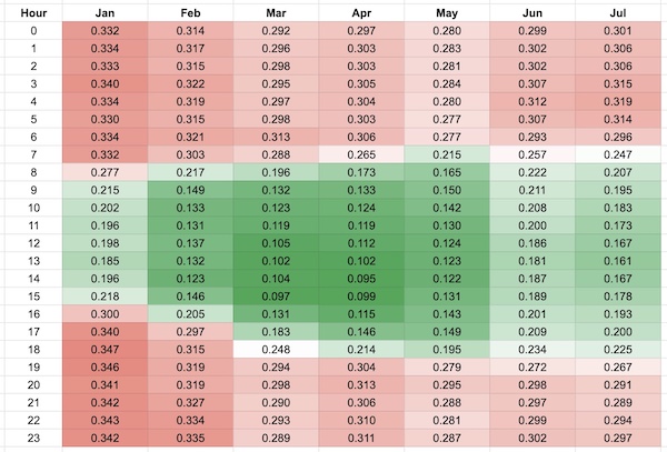
Emissions intensity, in mTCO2/MWh, at a point in time for every hour of every Wednesday to date in 2022. Data source: CAISO
This chart and the battery charts indicate that the grid has a lot of gas on it during winter mornings, but gas that is running pretty efficiently. That may change as more people adopt heat pumps, but at least for now these are pretty efficient gas plants running at steady state. The heat pump is also efficient, using only one-third the energy that a gas boiler would use. If the grid were a full 70% gas with turbines operating at a reasonable 45% efficiency, the heat pump still reduces emissions by about 50% on winter mornings (0.7 / (0.45 * 3)), and more at other times. That’s not too bad! Plus the grid is only getting cleaner. The chart below shows all of the low-emission power California is investing in that will operate at all hours of the day.
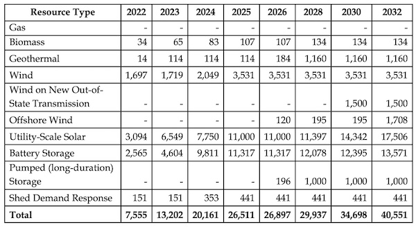
Planned resource buildout for California’s power grid. Source: California Public Utilities Commission, December 2021
The grid is a complicated system. To keep things simple while still helping people to save money and reduce emissions, most of our local utilities have rolled out time-of-use rates. They are designed to encourage people to use electricity at the “right” times. But those rates are a coarse tool that do not reflect the full complexity of the system. The grid is dynamic -- demand ramps up and down, different types of power plants go online and offline, weather changes affect solar and wind power, and transmission lines get congested. Time of use rates cannot begin to approximate all of that. We could save money and address global warming by better aligning electricity prices with costs and emissions. With that aim in mind, California’s Public Utilities Commission is looking at offering real-time electricity prices that would incorporate the ever-changing costs of generating and delivering electricity. Smart electric appliances (chargers, thermostats, pumps) could read those prices and adjust their operation, within constraints, to reduce emissions and help customers save money. I will write more about that in an upcoming blog post. It would be a massive change with many implications.
For now, I hope you have a better sense of how emissions intensity varies on our grid, by the hour and by the month, and a better idea of how you might reduce your own footprint by shifting when you use electricity. I’d love to hear any questions or observations you have.
P.S. If you want to understand emissions intensities a little more, this interactive map shows (somewhat delayed) emissions intensities in electric grids around the world. The units are different from what is used in this blog post, so divide by 1000 to match the units shown by CAISO. (Instead of 0.3 you will see 300.) You can see that our grid is pretty good compared to much of the world, and certainly compared to much of the US. You can navigate around to see what types of plants are running. Look at all the coal being burned in Indonesia and Poland, for example.
Notes and References
1. California’s imports are often from low-emission sources such as hydropower or wind, but in this case the emissions data indicate that imports were mostly gas.
2. By “all of us”, I mean those of us in California, and more specifically in the 80% of California that CAISO covers.
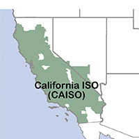
3. This is a somewhat subtle point. Our power providers are not required to align their generation curve with our demand curve. When there is a mismatch, as there almost always is, the “clean power” utilities effectively rely on other utilities to provide (dirtier) power for their customers when their clean power is inadequate (e.g., 4-9pm or night). So even customers with “clean power” utilities can reduce their emissions by shifting more of their electricity use to times when the grid has more clean capacity. That will mean that dirtier gas plants will run less.
4. mT = metric ton, MWh = megawatt hour. These efficient gas plants are assumed to be running in steady state, not ramping up or down, which increases their emissions. Less efficient gas plants, like “peaker plants” that run only as a last resort, have even higher emissions intensity. The 0.4 value also ignores any reserve requirements the grid has.
5. The graph shows one value at the top of the hour, for every hour during the week.
6. Each square shows only a single measurement taken during the hour. Measurements within each hour were not averaged.
7. The CEC has recently published an API called MIDAS that makes this information and more available to developers. The CPUC's Self-Generated Incentive Program (SGIP) also makes available an API with real-time marginal emissions data provided by WattTime that is used to ensure that participating storage is used for more than just backup emergency purposes.
8. Specifically, one measurement from every hour from every Wednesday was averaged to make this chart. Measurements within each hour were not averaged.
9. The electric system has “distribution losses”, where transmission lines and the distribution network lose some amount of electricity as it moves from the power plant to the home. These losses effectively increase the emissions intensity of an electrified system. The gas system has methane leaks, both in production and in distribution. These leaks also effectively increase the emissions intensity of a gas-based system system. I am ignoring both in this post.
Current Climate Data (June 2022)
Global impacts, US impacts, CO2 metric, Climate dashboard
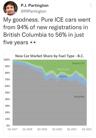
On the good news front (ICE stands for Internal Combustion Engine, i.e., a gas car) ... (source):
Comment Guidelines
I hope that your contributions will be an important part of this blog. To keep the discussion productive, please adhere to these guidelines or your comment may be edited or removed.
- Avoid disrespectful, disparaging, snide, angry, or ad hominem comments.
- Stay fact-based and refer to reputable sources.
- Stay on topic.
- In general, maintain this as a welcoming space for all readers.


