
Gas prices in Minneapolis on January 30 (Photo credit: Karen Listgarten)
It always amazed me how cheap gasoline was in Minnesota, and in fact pretty much anywhere outside of California. This data from the US Energy Information Administration backs that up. We pay about a 40% price premium for gasoline.
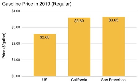
We pay about 40% more for gasoline. Source: US, CA, SF
What I didn’t realize on all of those trips is that the gasoline prices in California are nothing compared to the electricity prices we pay here. (It did not occur to me to look at my sister’s electric bills!)
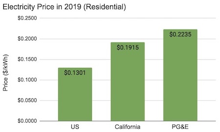
Our electricity prices are high! Source: US and CA, PG&E (1)
We pay 47% more for electricity in California than in the US on average, and an eye-popping 72% more in the Bay Area. Ouch. I wonder if we would be doing things differently if electricity prices were posted on signs just like gas prices...
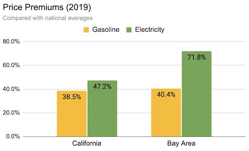
Our electricity is even pricier than our gasoline, compared with national averages.
I’ve been wondering about this because:
(a) Our electricity relies on cheap renewables and natural gas, so it’s not clear why the rates are so high; and
(b) High electricity prices make it harder for us to electrify and hit our emissions goals. Why are we trying to run a race (emissions!) while shooting ourselves in the foot (high prices!)?
To begin to answer this question, I looked at this chart from the California Public Utilities Commission’s annual report on electricity and natural gas costs. It shows a breakdown of our electricity rates. You can see that the cost of generating one additional kWh of electricity -- the generation cost -- is relatively small compared to the rate we pay. Much of the rest comes from transmission and distribution, which are largely fixed costs, along with a small amount for “public purpose” programs like energy efficiency, EV infrastructure, and discounts for low-income households. (Remember those heat pump water heater rebates from the last post? We pay for them via our utility bills.)
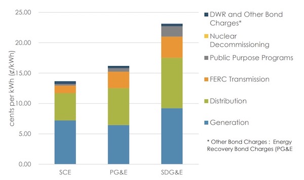
Electric rate components. Source: CPUC report for the year 2019.
This chart helps to explain why rates from Peninsula Clean Energy and Silicon Valley Clean Energy aren’t as low as you (or they) might hope. They have to pass along most of the PG&E costs as well as a supplementary “franchise” fee. They are able to save you money only on the blue “generation” component. (2) More generally, this chart shows that cheap renewables can only do so much for our prices if other costs like distribution and transmission are high. (3)
So are we stuck with high electricity bills? It seems unlikely that distribution and transmission will get much cheaper, especially with wildfire and other safety concerns. (4) But some researchers are asking whether these large, generally fixed costs belong on our bill to begin with.
Severin Borenstein, an economist at UC Berkeley who is an expert on electricity pricing, argues that by pricing our electricity using high “average costs” rather than the smaller incremental or “marginal” costs, we are causing a number of problems. The higher prices mean that customers are less likely to switch from gas to electricity, and wealthier homeowners are more likely to bypass the system with rooftop solar and home batteries. (5)
When electricity is nearly free, moving away from gas looks pretty appealing. As the solar households electrify their homes, paying neither gas nor electricity bills, lower-income households are left holding the bag, paying an increasing share of the fixed costs of both utilities.
The pricing incentives are pretty messed up when it comes to equitable electrification.
There is something inherently unfair about incorporating fixed costs into our electricity rates, but it may not be obvious. After all, it seems like a good way to pay for the poles and wires, vegetation management, and so on. Indeed, it’s pretty common to put fixed costs into product prices. A retail store will incorporate the costs of its buildings into the prices it charges. The price for a gallon of gasoline will include the costs of maintaining the distribution network. In this way, everyone pays for those costs in proportion to what they buy. It seems fair, right?
Well, not so much when it comes to electricity. The problem is that people of all income levels use similar amounts of electricity. (An economist would say that demand for electricity is relatively “inelastic”.) As a result, allocating fixed costs based on electricity usage hits lower-income households harder.
Borenstein shares this graph illustrating the concept:
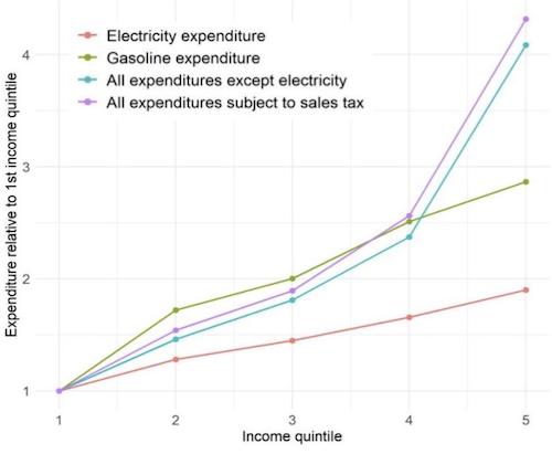
It is less equitable to include fixed costs in electricity rates than it is to include them in gasoline prices or product prices more generally. Source: The Energy Institute Blog, 2020
The orange line at the bottom, showing what we spend on electricity relative to the lowest-income households, is pretty flat. Wealthier people do spend more on electricity, but not much more. In contrast, wealthier people spend a lot more than lower-income people on gasoline (the green line), and even more on stuff in general (the purple line). Because the orange line is so flat, bloating electricity rates with fixed costs disproportionately hurts low-income households, even more so than a gas tax or a sales tax. This gets even worse as higher-income households move to solar and stop paying these costs. (The orange line gets flatter and could even slope downwards.)
Borenstein proposes that rather than allocate fixed costs based on electricity usage, we allocate them based on income. He outlines a few ways that could be done, including tax credits (ala the Earned Income Tax Credit). Borenstein’s blog post on this topic is worth reading, as well as this comment (“This is turning electricity supply into a public good on the same order as education and public health.”) and this one (“The problem is not so much rate design as it is the excessive revenue requirements of the California IOUs.”).
What impact would removing fixed costs from our bills have on prices? Borenstein and Bushnell model how rates across the country could evolve if our rates reflected only the incremental cost of adding new power. The map below shows today’s marginal price per kWh. You can see that prices are high here in California as well as in the northeast.
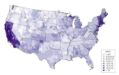
Price per kWh across the US. Source: Borenstein and Bushnell, 2019
If states were to remove the fixed costs from their rate structure, so that rates better reflected the cost of producing one more kWh, the rates might look like this. (This is referred to in the paper as the “private marginal cost”.)
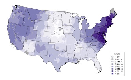
Private marginal cost estimates. Source: Borenstein and Bushnell, 2019
California is no longer an outlier!
Borenstein and Bushnell also look at an alternative adjustment. What would happen if electricity rates reflected the costs of pollution emitted by power plants? They might look like this, reflecting dirty power in several areas of the country. (The paper refers to this as the “external marginal cost”.)
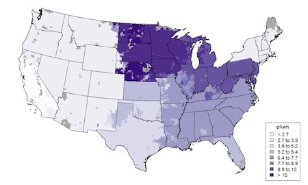
External marginal cost estimates. Source: Borenstein and Bushnell, 2019
If you combine these two changes -- removing fixed costs and incorporating pollution impacts -- the prices might look like those shown below, which the paper refers to as the “social marginal cost”.
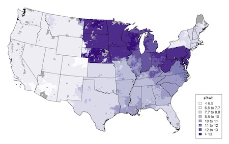
Social marginal cost estimates. Source: Borenstein and Bushnell, 2019
That is the kind of electricity pricing I could get behind! (My sister in Minnesota, maybe not so much.)
The point is, prices have consequences and we have options. In California, and across the country, we should have energy prices that align with our policies. The high electricity prices and underlying rate structure in our state are hurting our ability to fuel switch and hitting low-income households with more of the fixed costs. Moreover, the high prices are encouraging homes to move to off-grid power. As generally high-income earners switch to rooftop solar and then electrify their homes, greatly reducing their utility bills, lower income households end up paying even more. That cannot be the future we seek. Our electricity pricing should be designed to turn us away from fossil fuels both quickly and equitably. We must do better.
Notes and References
1. I use the PG&E price quoted from EIA specifically because the other two prices come from there as well and I wanted the methodology to be consistent. (For example, they likely incorporate the CARE rates.)
2. Peninsula Clean Energy has a good description of its rates in the middle of this page, including how they compare with PG&E.
3. Palo Alto’s rates are significantly lower than PG&E, by about 30%. This is partly because the city has a very inexpensive hydropower contract, and partly because it is a municipal utility with other costs independent of PG&E. However, even Palo Alto found that its transmission costs went up 15% last year.
4. We should ask why our transmission and distribution costs are so high. My sister’s Minnesota electricity is cheap (11.4 cents/kWh) and her rates include both transmission (1.5 cents) and distribution (4 cents). That is much less than PG&E’s 4 cents and 10 cents, respectively. While we could move the costs off of our bill, we should also look into reducing them!
5. There is an argument to be made that rooftop solar is not priced properly, with power providers paying retail for rooftop solar power that they would otherwise pay wholesale for. I will write about that in a future post. Questions include how to value the added resilience and reduced load on the grid that rooftop solar provides.
6. In case you are wondering, our natural gas is also more expensive than the national average, but not by as much as electricity.
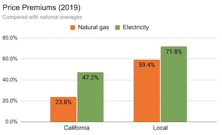
Price premiums for residential gas and electricity. Gas prices: US, CA, PG&E. Electricity prices: US and CA, PG&E (The local gas price shown here is sourced from PG&E, while the others are from EIA. It’s possible they are calculated differently.)
Our natural gas rates have a similar structure to our electricity rates, with distribution and public benefits included. According to this CPUC writeup from a few years ago, the cost of the gas is about 31% of the rate, transportation costs are twice that, and the public purpose charge is the remaining 7%. If only the wealthy are able to move away from gas, these fixed costs will hit the remaining lower-income gas users that much harder.
Current Climate Data (December 2020)
Global impacts, US impacts, CO2 metric, Climate dashboard (updated annually)
Comment Guidelines
I hope that your contributions will be an important part of this blog. To keep the discussion productive, please adhere to these guidelines or your comment may be moderated:
- Avoid disrespectful, disparaging, snide, angry, or ad hominem comments.
- Stay fact-based and refer to reputable sources.
- Stay on topic.
- In general, maintain this as a welcoming space for all readers.


